
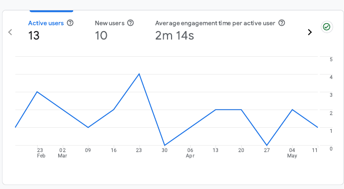
This summary chart provides a combined view of user growth and interaction trends. Over the 90-day period, the website received 13 active users and 10 new users, with an average engagement time of 2 minutes and 14 seconds per user.
User traffic was distributed over time with noticeable peaks near late March and mid-April. The relatively stable engagement time suggests that visitors are actively reading and interacting with the content once they land on the site. Increasing content variety and adding prompts for further exploration may help sustain and grow these metrics.
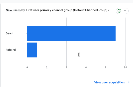
This graph breaks down how new users arrived at the website. Out of 10 total new users, 9 accessed the site through direct traffic—which likely includes manual URL entry or bookmarked links—while only 1 came through a referral from another site.
These numbers highlight the importance of direct sharing and personal distribution of the site link. To improve referral traffic, it's recommended to publish the portfolio link on platforms like LinkedIn, GitHub, forums, or course directories, and ensure descriptive metadata is present for better visibility in search engines.
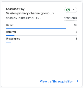
This chart shows that the majority of user sessions (36) came through Direct traffic, meaning users likely typed the website address manually or accessed it via a saved bookmark. Referral traffic accounted for 5 sessions, which indicates some engagement through links from other websites or shared sources. Additionally, 3 sessions were categorized as Unassigned, meaning they could not be tracked to a specific channel. These insights suggest that while the site has a strong base of direct visitors, there is room to grow in terms of referral or organic search traffic by improving SEO and building external links.
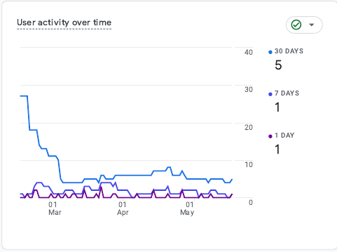
This chart illustrates how user engagement trends have evolved over the 3-month period. The blue line indicates 30-day activity, which started high in early March but gradually decreased. Despite this decline, a steady baseline of user engagement was maintained through April and May. The 7-day and 1-day activity lines (purple tones) remained relatively flat, reflecting short-term user consistency.
With 5 users active in the past 30 days, 1 in the past 7 days, and 1 on the most recent day, the site shows some recurring visits but lacks recent spikes. This pattern highlights the need for re-engagement strategies—such as promoting new content or sending periodic updates to drive fresh traffic.
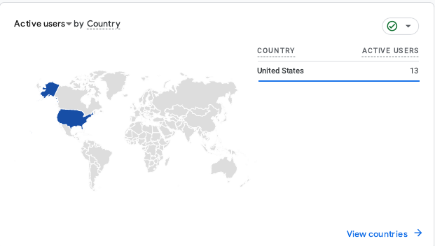
This world map visualization displays user distribution by country. All 13 active users originated from the United States during the analyzed period. This localized traffic suggests that the site's current reach is concentrated within the U.S., likely due to academic context and regional promotion.
While this is expected for a course-specific portfolio site, future improvements could include optimizing content for international accessibility. Strategies such as language localization, regionally neutral design, and wider promotion on global platforms could help attract a broader, more diverse audience.
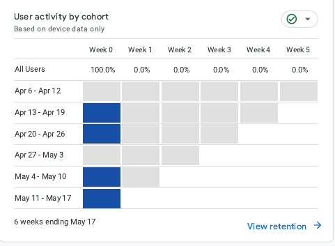
The cohort chart visualizes how different groups of users, segmented by the week of their first visit, remained active over time. In this case, all cohorts show activity in Week 0 only, with no continued engagement in the following weeks (Weeks 1–5).
This pattern suggests that while new users are visiting the site weekly, they are not returning after their initial session. Retention is effectively 0% beyond the first week. To improve this, future strategies could include follow-up content, email reminders, or interactive features that incentivize revisits. Building consistent value for returning users is essential to enhance retention rates.
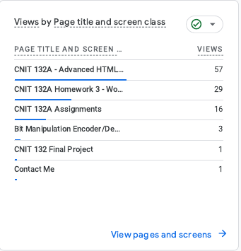
This report highlights which pages received the most attention from users. The CNIT 132A homepage leads with 57 views, followed by Homework 3 (29 views) and the Assignments page (16 views). More technical or project-specific pages such as the Bit Manipulation Encoder/Decoder had minimal yet meaningful interest (3 views).
This insight shows that core landing pages and visual assignments are highly engaging. However, pages like Contact and Final Project only received a single view each. To drive more interaction with those areas, consider improving their visibility within the navigation menu, linking them from high-traffic pages, and enhancing their content structure.
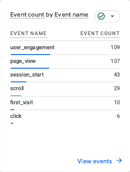
This section summarizes how users interacted with the site through various measurable events. The most frequent event was user_engagement with 109 triggers, followed closely by page_view (107). These numbers indicate users not only loaded pages but also stayed and interacted with the content.
Additionally, there were 43 session_start events and 29 scroll events, showing users explored beyond initial page loads. The site also registered 10 first_visit events, confirming unique newcomers during the period. Finally, 6 click events indicate some interaction with buttons or links. These metrics can guide future enhancements in layout and interactivity to boost click-through rates and time-on-page.
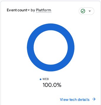
According to this platform analysis, 100% of all user events were recorded through web browsers. This donut chart confirms that no interactions came from mobile devices or apps, which is expected given the academic context and desktop-oriented user base.
While current engagement is entirely desktop-based, ensuring full mobile responsiveness is still essential. Optimizing layout, fonts, and navigation for smaller screens can improve accessibility and attract potential visitors using mobile or tablet devices.